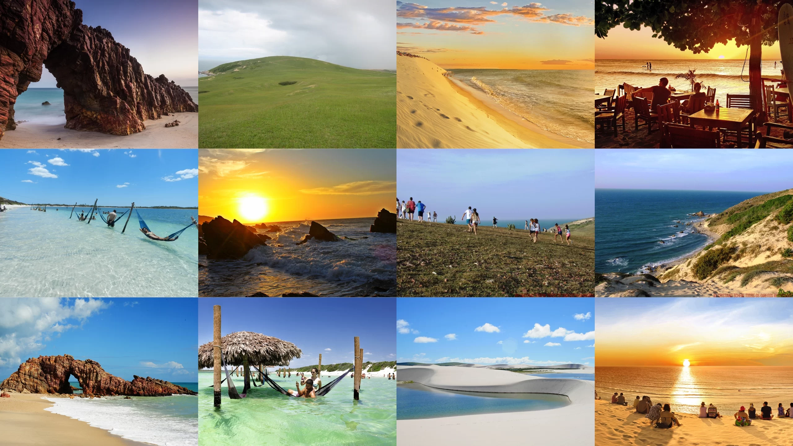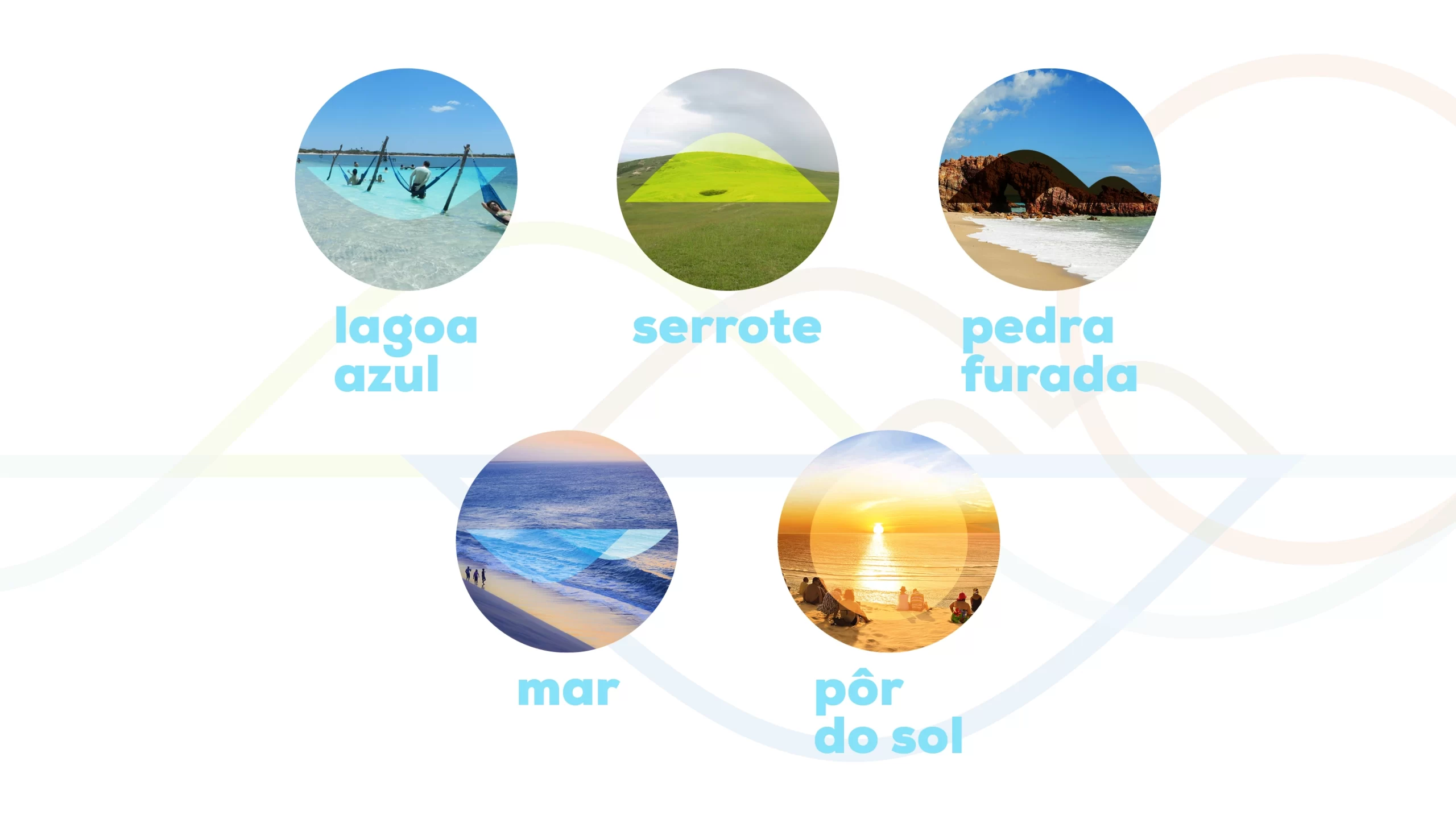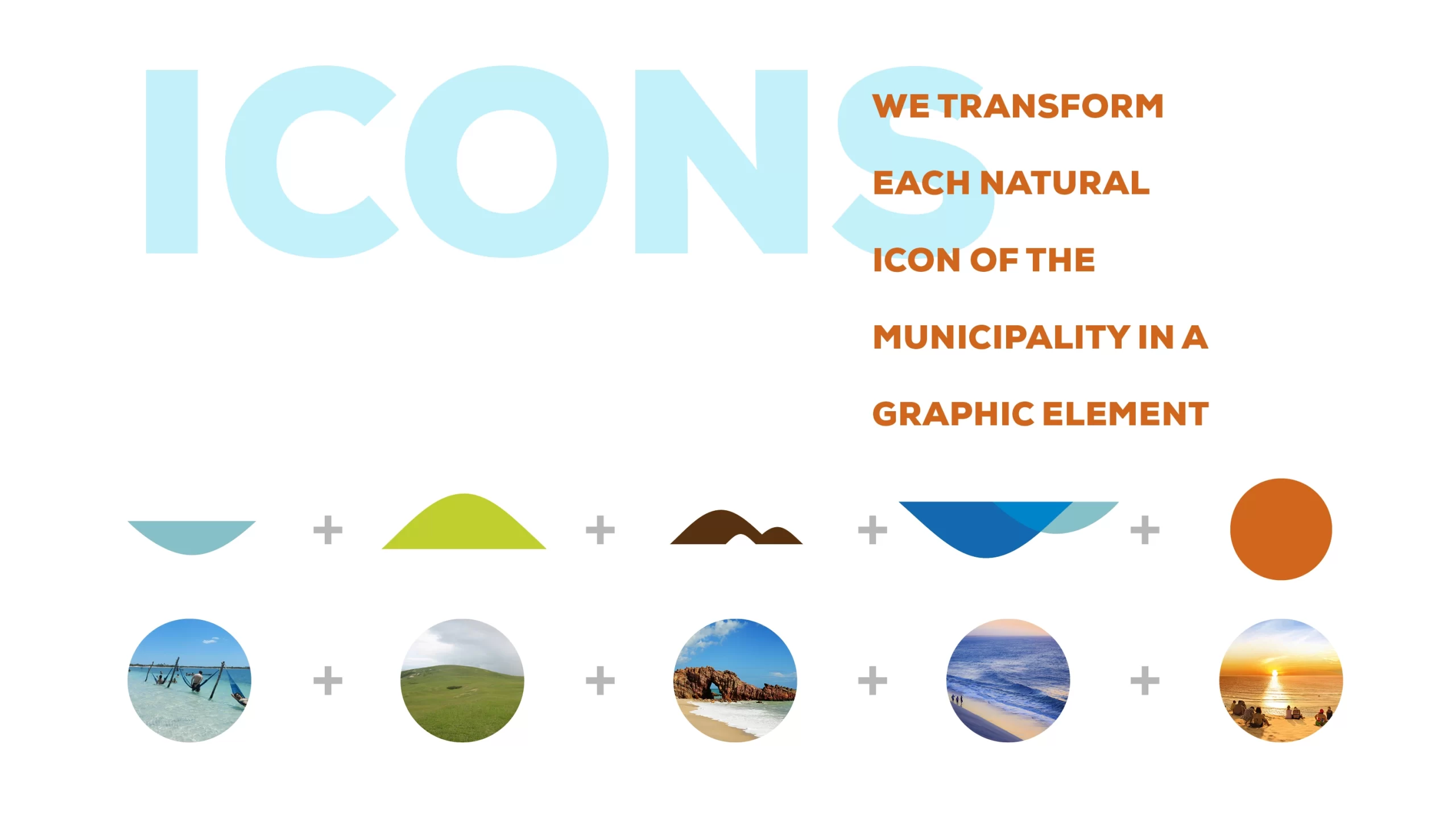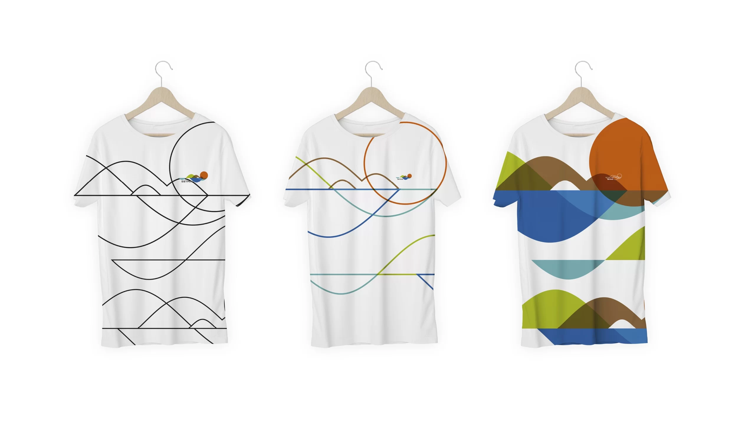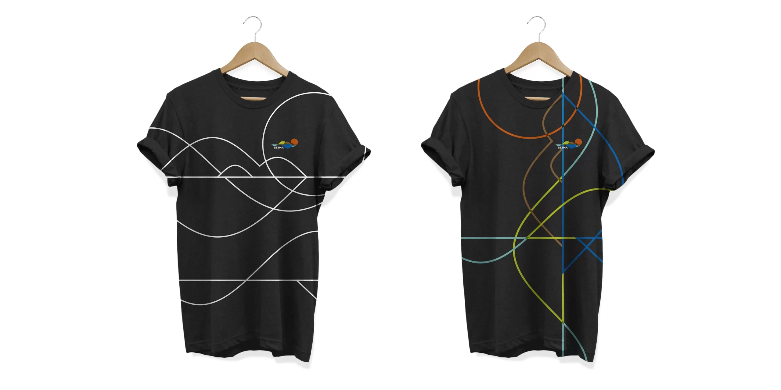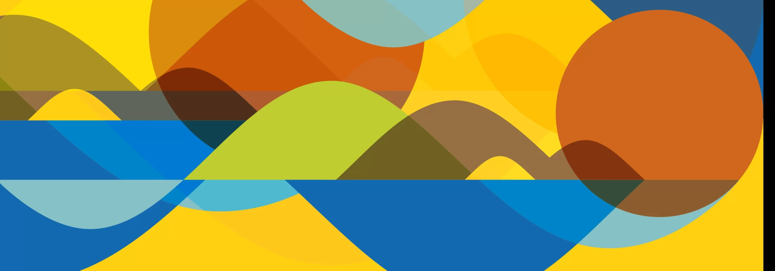
The design concept appropriates the natural wonders of the municipality to represent in a drawing everything that the municipality offers its tourists and visitors. From the lagoon, past the dunes, serrote, the stone pierced, the sea and the iconic sunset.
To unify all these elements, we use curved sine-wave elements, which represent the frequency, balance, and harmony between all natural beauty and the tourism it provides.
Links:
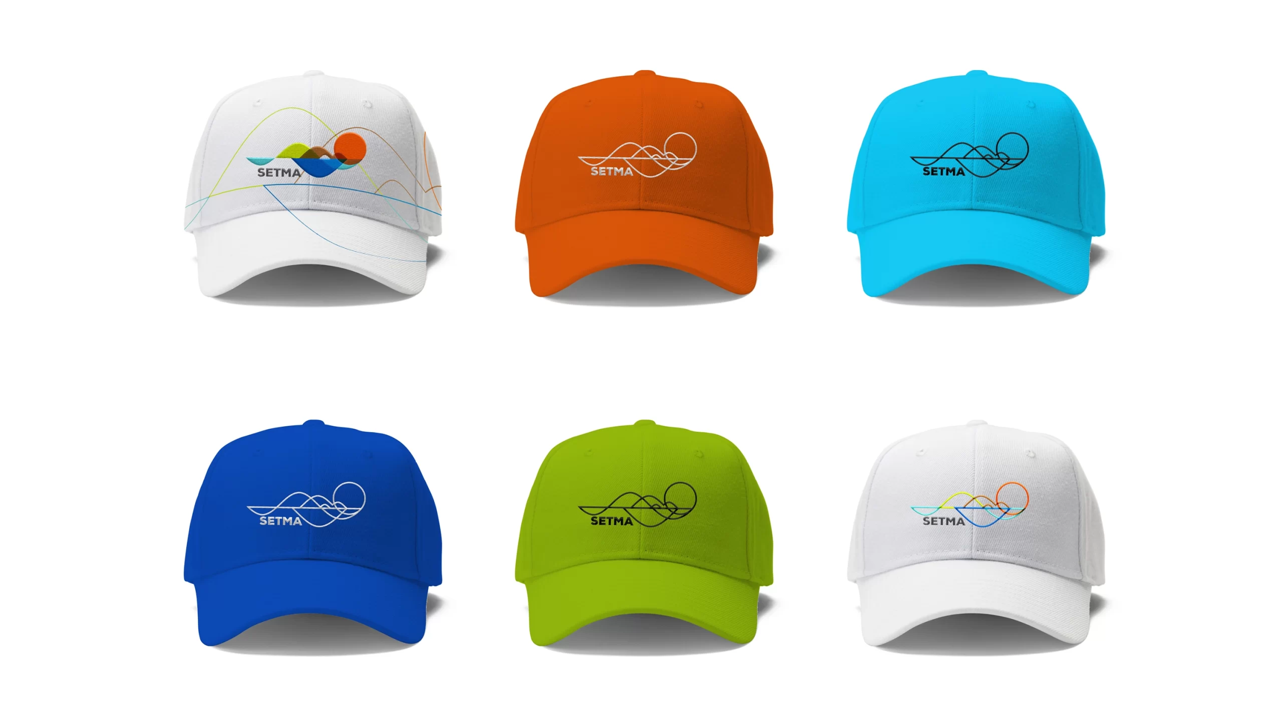
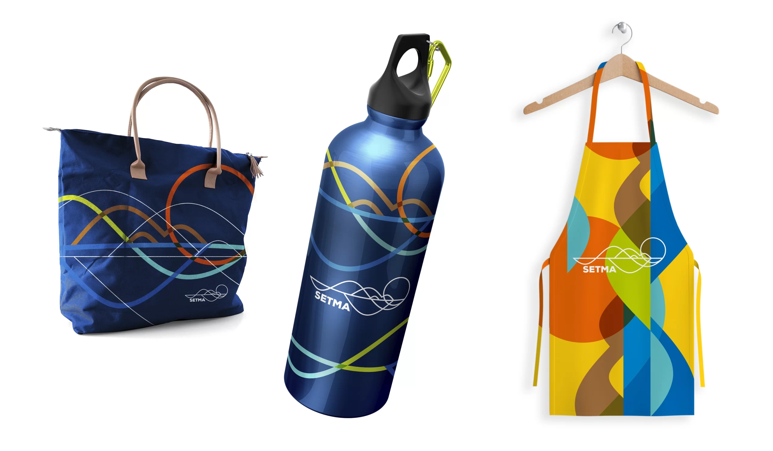
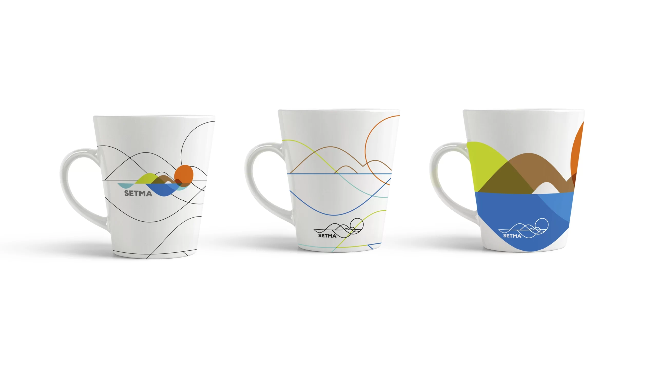
Thus we arrive at a simple, striking, elegant, modern and current design. With the colors and the balance of nature, which can be represented both full and in lines, marking even more the lightness, joy and harmonious balance of the region. Providing an additional incentive, both for tourists, visitors and residents, as well as for the preservation of the entire environment.
Visual Identity
